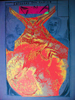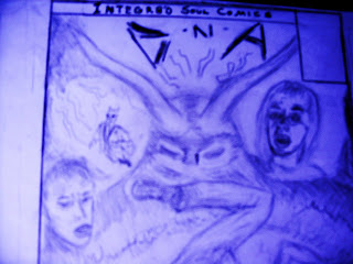


I'm about to invert the colors on some of these pictures...the tinting...and then, I'm going to scan it. Then we brush the water soluble pencils with a bit of moisture.
Here's something that I'd like to do as an in-house ad, like, in the back of STuckWayze:
[IMG]http://i34.tinypic.com/2na4qj8.jpg[/IMG]


I will step back, look at this, get a feel for where we are. The scan goes into the e-mail of our inker. The inker's embellishments will prepare the pencils for print.


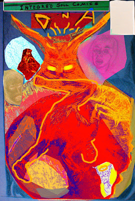
Here is one treatment of my various elements; the colors aren't all tightly confined to the figures and objects or even the flames. It's meant to embody an internal state (yeah, I'll go with that!), a feeling.
Now, the shadows are positioned to represent a glow around the spherical element, so it lights and shades objects outside it and above it as though it is lit from within. (I started with photographs, taken with a lamp focused on fire spewing from the board at the bottom, to wash it out but to give it more luminescence. The top would then have deeper shadows, though the light can't fall on the objects as though they are three dimensional. The challenge of shadowing objects as raised and blocking light will continue through other pieces.
The drawing is actually a fairly traditional representation of its classically presented subjects. The Photoshop experiments reflect the amusement park like ride's sickening sense of motion unleashed. I used paint to outline the figure and light the eyes. I should see if I can take those base colors and diffuse them to create a less opaque glow ambient to the source (i.e. the eyes).

No comments:
Post a Comment